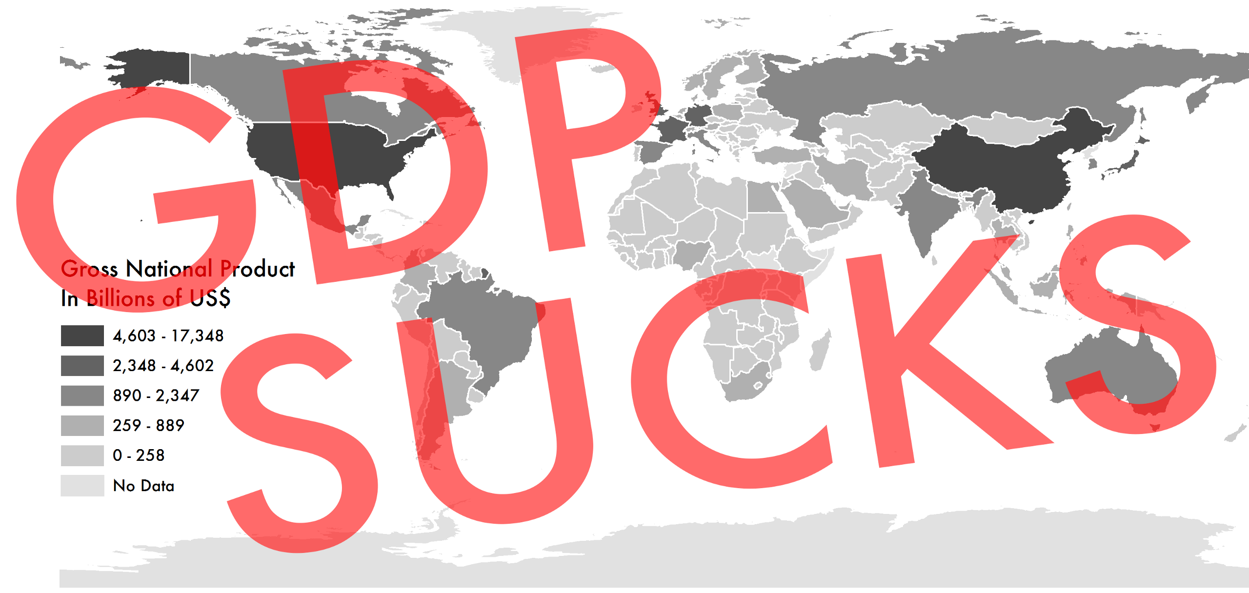

Gross Domestic Product is the scourge of the modern world. Well, maybe that’s a bit strong. But an economic obsession with GDP, as it’s more commonly known, is at the root of almost every problem facing humankind today.
It’s pretty simple as a concept–GDP is merely a tally of the monetary value of all products and services produced and sold inside a country over a specific time period (usually a year).
So simple, in fact, that it dates back farther than you probably imagine. English economist William Petty came up with the concept in the 17th century as a method for defending landlords against disproportionately high taxation during a war with the Dutch.
As a landowner himself, Petty asserted that the government’s income should equal its spending. Breaking apart the figures necessary to calculate GDP, he argued that since a far higher share of Britain’s spending came from paying wages, the tax burden should be shifted accordingly–that is to say, tax the workers instead of the assets of rich landowners. Back then, such thinking was used to fight the government. Today, it couldn’t be more politically mainstream.
Later that century, Charles Davenant further refined Petty’s work. Still, the modern concept of GDP didn’t emerge until 1934–when Nobel Prize-winning economist Simon Kuznets prepared a report for the U.S. Congress. Kuznets’s goal was to measure the nation’s productivity in the hope of developing a solution to the Great Depression. His work was so precise and comprehensive that it set the standard for such calculations. Today, Kuznets’s version of GDP is by far the most popular method for judging a country’s success.
Which is a problem. Because it’s awful. The way it’s calculated–by adding up every occasion when money changes hands–means that disasters and crime are treated as economic gain. It ignores crucial societal roles like childcare and volunteer work (because they don’t generate a salary), not to mention concepts like tolerance, freedom, and human rights. It whizzes past any concerns about income inequality. It increases with pollution, and then again with the subsequent cleanup. Worst of all, it treats the exploitation of natural resources like coal, oil, or rainforests as mere income–not the slow disappearance and devaluation of valuable environmental assets.
I’m not the first to call for its obliteration. In 2007, the European Union convened a conference trying to move “Beyond GDP.” In a 2014 Nature article, an influential collection of development economists urged the world to jettison the measure. That same year, Nobel laureate in economics Joseph E. Stiglitz lambasted the United States for its “GDP festishism.”
Don’t blame Kuznets, though: He himself warned of relying on single numbers to represent complex systems like economies in his report, writing:
The valuable capacity of the human mind to simplify a complex situation in a compact characterization becomes dangerous when not controlled in terms of definitely stated criteria. With quantitative measurements especially, the definiteness of the result suggests, often misleadingly, a precision and simplicity in the outlines of the object measured. Measurements of national income are subject to this type of illusion and resulting abuse, especially since they deal with matters that are the center of conflict of opposing social groups where the effectiveness of an argument is often contingent upon oversimplification. The welfare of a nation can scarcely be inferred from a measure of national income.
Today, several alternative metrics have emerged that aim to replace GDP for better comparing nations. Each comes with slightly differing objectives and worldviews. Each has its own benefits and drawbacks. All are worth considering to get a full picture of the state of the world.

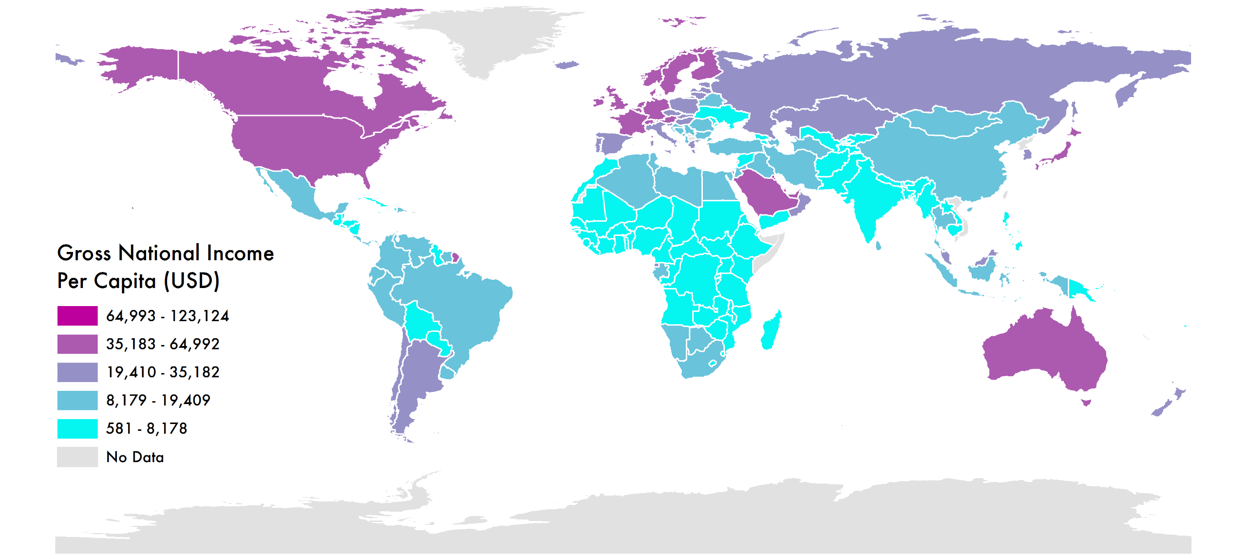
Gross National Income per Capita
While GDP measures a country’s raw economic output inside its borders, GNI measures the economic output of its citizens–taking into account the globalization of modern business. It’s calculated by adding up all the income of the residents of a country, including that received from abroad. As such, it helps show the economic strength of a country’s population, rather than the country itself. Measuring per capita allows the effects of fluctuating populations to be negated. Higher numbers mean a country’s citizens earn more.

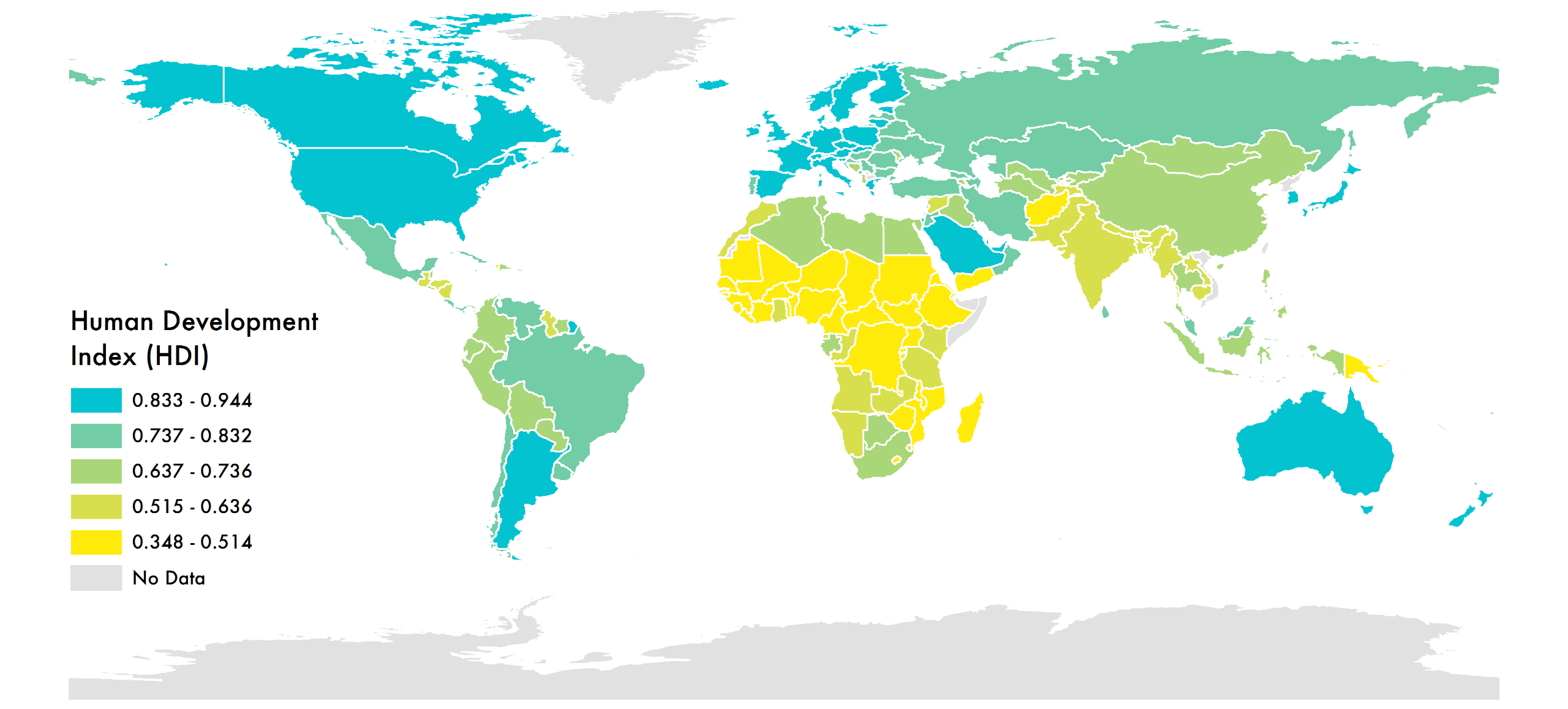
Human Development Index
Alongside financial measures, the Human Development Index combines statistics on life expectancy, education, and income per capita to rank countries into tiers of development. Often framed in terms of whether people are able to “be” and “do” desirable things in life, HDI was developed by Pakistani economist Mahbub ul Haq and is backed by the United Nations. The higher the number, the more “developed” the country.

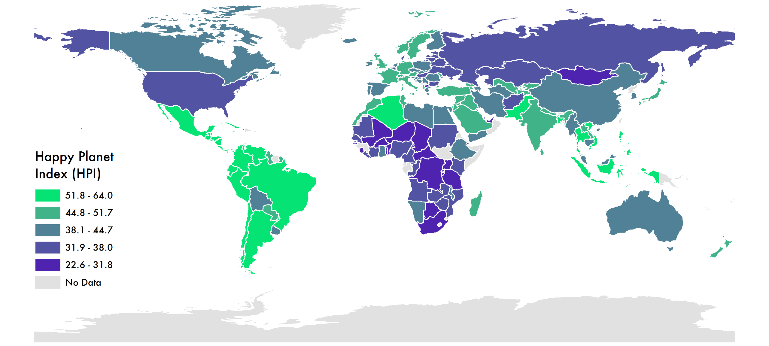
Happy Planet Index
In 1972, the fourth Dragon King of Bhutan announced that his country would no longer strive for Gross National Product but instead for Gross National Happiness. Since then, several attempts to assess the happiness of countries worldwide have emerged, but the leading measure today is the Happy Planet Index. It uses global data on life expectancy, experienced well-being, and ecological footprint to calculate an index that ranks countries on how many long and happy lives they produce per unit of environmental input. The higher the number, the happier the population.

Gini Coefficient
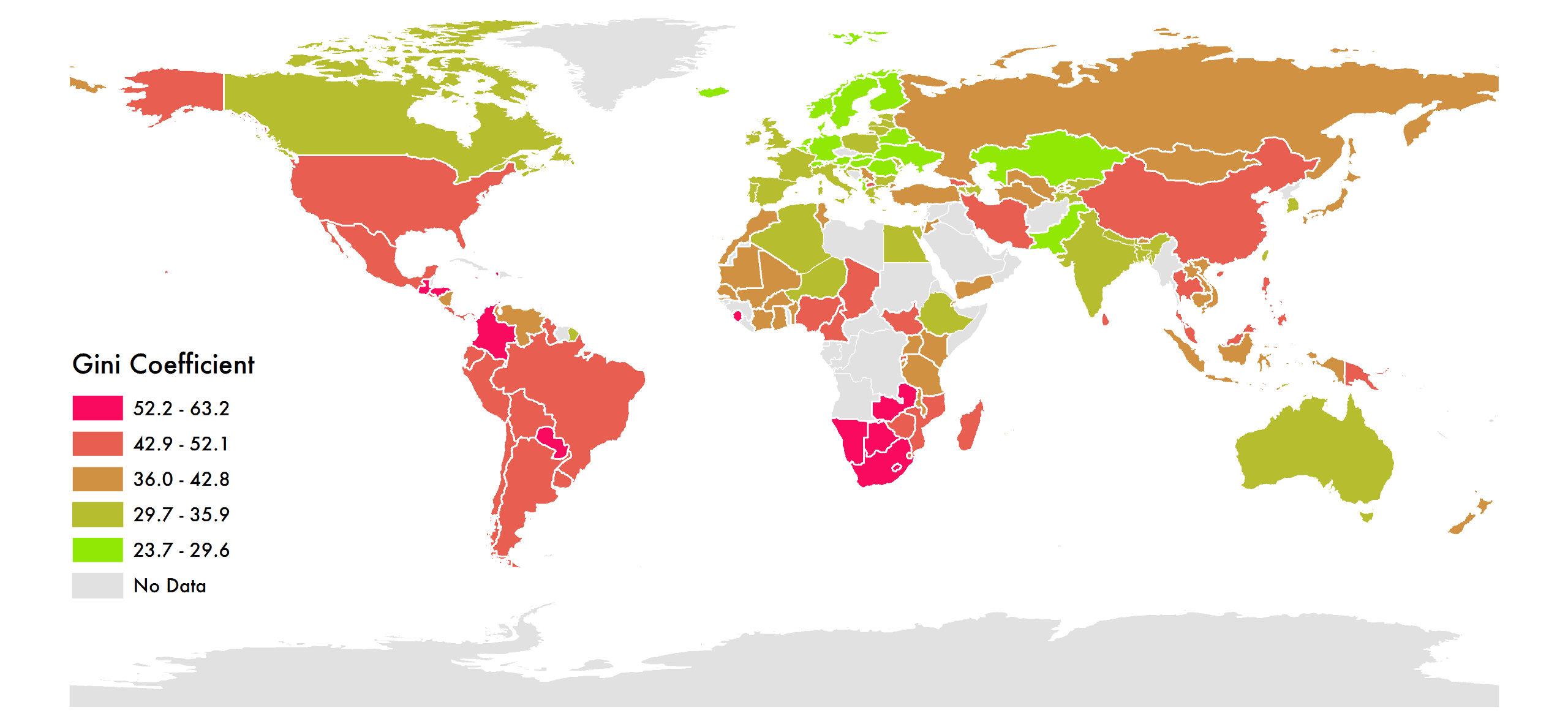
One of the biggest issues with GDP is that it ignores inequality. The Gini coefficient, invented in 1912 by Italian statistician Corrado Gini, represents the income distribution of a nation’s residents. A low number represents low inequality, while a high one indicates a major gap between the rich and poor.

Social Progress Index
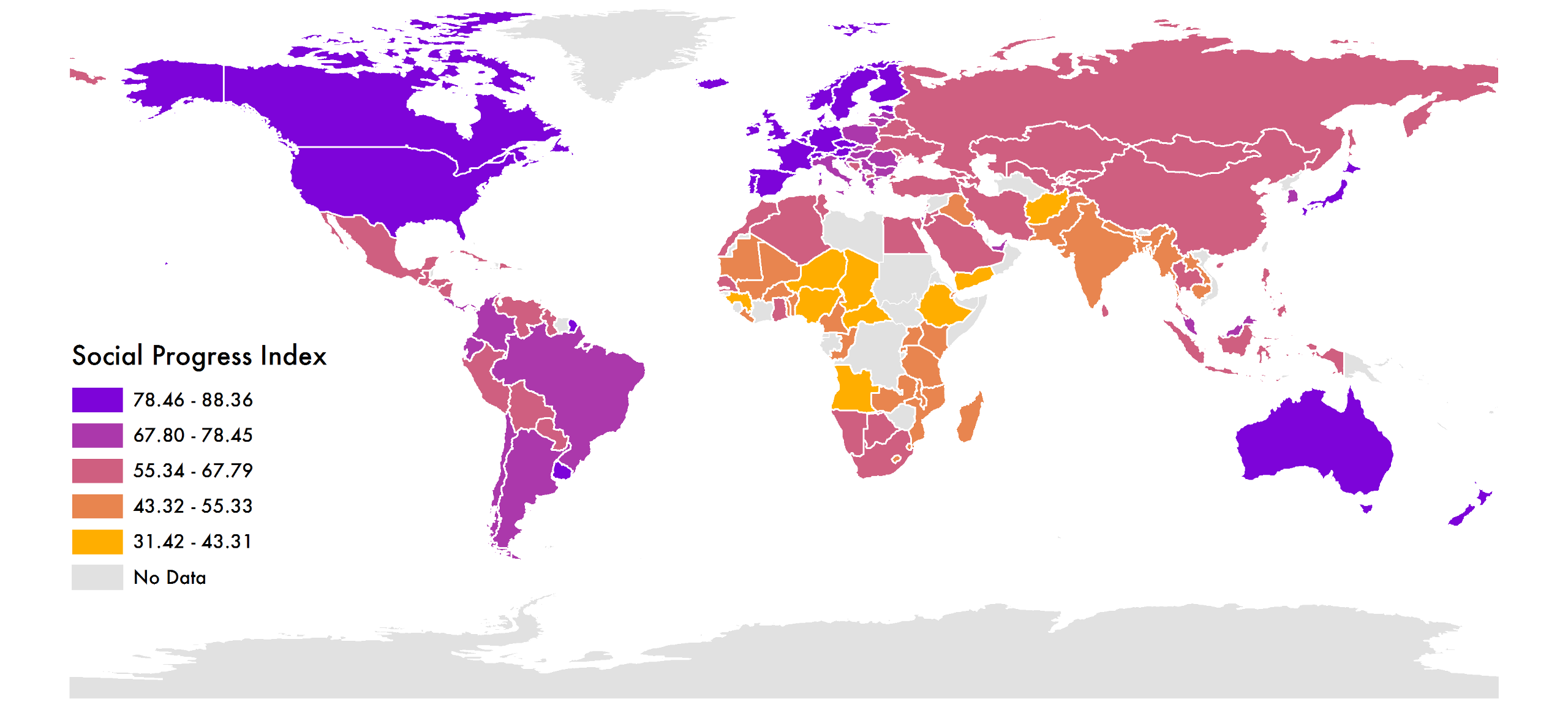
Perhaps the most general rating in this list, the Social Progress Index measures 52 different factors, from access to knowledge and wellness to personal safety and environmental sustainability. It targets outcomes like access to electricity (rather than inputs like government policy) and is used widely across South America to target development work. The higher the number, the greater a country’s social progress.

Genuine Progress Indicator
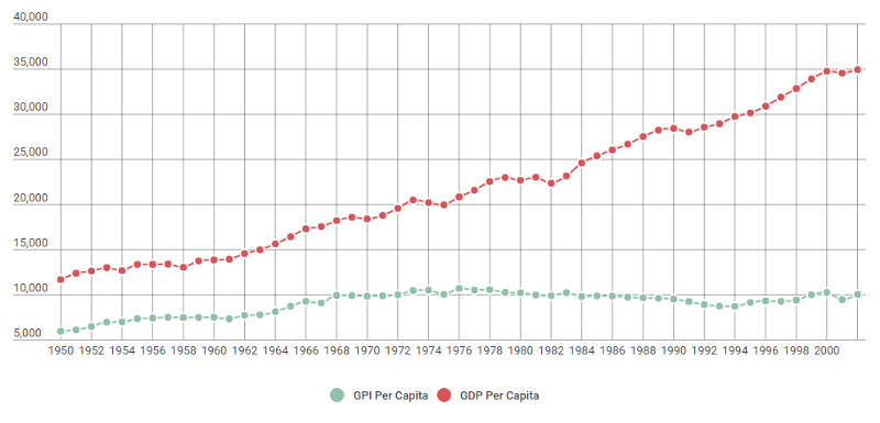
In 1995, U.S. environmental economics think tank Redefining Progress created the Genuine Progress Indicator–an attempt at helping policymakers measure how well their citizens are doing both economically and socially. GPI starts with the same data on which GDP is based but adjusts for factors like income distribution, household and volunteer work; it then subtracts for things like crime and pollution. Since it’s measured in the same terms as GDP, the two indices can be compared directly–and higher is better.
Unfortunately, there’s little global data available for the Genuine Progress Indicator, but the following graph from a Redefining Progress 2006 report illustrates GDP and GPI per capita for the United States between 1950 and 2004. “GPI per capita has barely moved since 1978, remaining near $15,000 since that time,” the report reads. “Over the period 1950″”2004, GPI grew at an extremely sluggish rate of just 1.33 percent.”


How We Get To Next was a magazine that explored the future of science, technology, and culture from 2014 to 2019. This article is part of our Made of Money section, which covers the future of cash, finance, economics, and trade. Click the logo to read more.
