In 1966 Norman Rockwell really needed a spacesuit–and NASA didn’t want to give him one. The space agency had hired the artist to visualize the Moon landing long before it would actually happen. To do that Rockwell needed to know what the astronauts would be wearing. He needed details. For him, telling the big story meant looking at the subtle facets that compose the whole. However, with the intense secrecy surrounding the mission, the answer to his request kept coming back the same. Denied.
For Rockwell, who was used to laboring over a painting for weeks or months with life models, working with NASA was a unique challenge. The agency would send him constant updates as the plans and designs of the lunar module changed and were updated, giving the painter–accustomed to creating with physical reference in front of him–a massive headache.
The man who eventually brokered the deal that got Rockwell his spacesuit was the director of NASA’s Art Program, James Dean. “I had [NASA’s first Chief of the Astronaut Office] Deke Slayton mad at me on one side and Norman Rockwell aggravated at me on the other,” he said. The suit was delivered to Rockwell’s studio, on the condition that it be returned every day and brought back again the next with its own technician and babysitter.
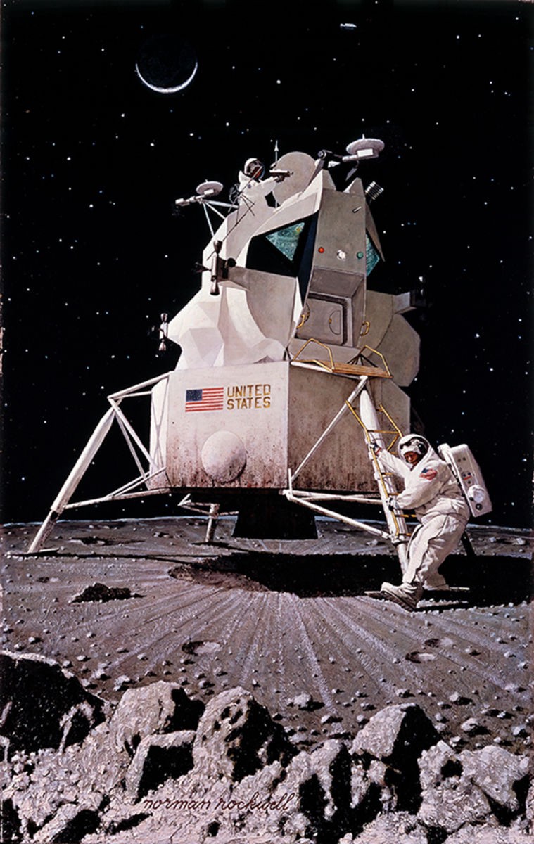
On January 10, 1967, over two years before Neil Armstrong first put his footprint in moondust, Look magazine published Rockwell’s painting. In it, a small spacecraft sits in the blasted landing area, with gray moon rocks in the foreground. From the small weathered capsule, bearing the flag of the United States, two figures emerge. One carries a handheld video camera, the other has one foot raised, his heel making first contact with an alien surface. This was the American public’s first glimpse of what would eventually become an incredible reality.
Rockwell could sell magazines–one of his covers would increase the circulation of The Saturday Evening Post tenfold. His “Four Freedoms” paintings toured the country in the 1940s and reportedly raised $132,992,539 in war bonds, while “The Problem We All Live With” brought the civil rights struggle into the homes of millions. If you were looking to spark the imagination of Americans and make them believe that a man could walk on the Moon, then Rockwell was the man you needed.
The collaboration between NASA and artists stretches right back to the start of the space program. It was founded on the back of a 1962 memo drafted by administrator James Webb, in which he suggested they use artists to bring a new perspective to NASA’s space program, and a more subjective view to its story.
“Important events can be interpreted by artists to give a unique insight into significant aspects of our history-making advances into space,” the memo read. “An artistic record of this nation’s program of space exploration will have great value for future generations and may make a significant contribution to the history of American art.”

But NASA’s Art Program was not the first time artists had worked closely with space pioneers, and Norman Rockwell may not have been the most famous artist to envision a trip to the Moon. Three years before the agency was founded, creative brains were already straddling art and science to take a serious look at the future of space travel. One of those brains was Walt Disney.
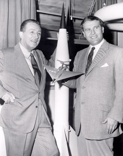
“Man in Space” was the name of three episodes from the Disneyland TV series (which were also assembled into a featurette that played alongside Davy Crockett and the River Pirates). Airing in 1955, two years before Sputnik launched and six years before Yuri Gagarin became the first man in space, it called on talents as diverse as Disney animator Ward Kimbell and the head of the U.S. Army’s Ballistic Missile Agency, Wernher von Braun. (This was probably one of the more unlikely pairings in Disney’s history.)
The resulting video shows how we might achieve a “Trip Around the Moon” in a dramatic, scored animation (most likely by Disney artist Frank Armitage, who also worked as a background artist on The Jungle Book and Mary Poppins). Scrub to three minutes 55 seconds and watch the short sequence showing the assembly of a space station and launchpad for the trip. Then, hang around to see von Braun’s presentation skills as he peers furtively at the script cards being held up off camera.
For von Braun, the endeavor was an opportunity to spark interest in the nascent space program, and if anyone could sell a hugely expensive space race–led by a former Nazi scientist–to the tax-paying American public, it was Disney. Weaving the story of how man could conquer space required that artists and animators use their storytelling expertise. It was this mix of science and Disney magic that helped the first episode attract 42 million viewers.
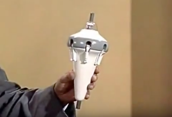
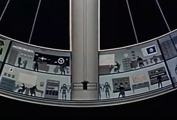
You can also see a version of the exterior of the space station by Chesley Bonestell here–compare it to the design of 1968’s artificial gravity space station from Stanley Kubrick’s 2001: A Space Odyssey. Bonestell would also provide artwork used in George Pal’s The War of the Worlds and Destination Moon, his futuristic imagination being equally useful to both scientific and cinematic vision. Though the concept of a rotating space station can be traced back even farther yet–to 1928 in Herman PotoÄnik’s “The Problem of Space Travel.”

The Space Race had two sides, of course, with the U.S. and Soviet Union both employing artists to showcase their ambitions. You can see some of the Soviet plans, from leaving Earth to setting up a lunar colony, in the semi-educational Road to the Stars made in 1956, four years before Gagarin’s historic mission.
The Russians were also producing their own art celebrating their glorious achievements in space, but whereas artists in the United States were given the artistic freedom to interpret what they saw however they wished, the house style of the Soviet Union followed the look of socialist realism that both celebrated their accomplishments and looked forward to the future. It also looks like rotating space stations were very fashionable at the time.
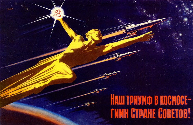


While propaganda on both sides played a part in the space race, important conceptual work was afoot even before NASA’s Art Program launched in 1962. NASA itself was founded in 1958, and the early influence of the pioneering “Man in Space” video on the agency is debatable, though Disney animator Ward Kimbell later claimed that President Eisenhower requested a copy of the program to show Pentagon officials to convince them of the merits of space travel.
However it came into being, artists were swiftly drafted in, initially working on everything from the earliest plans for satellites in Earth orbit, to drawings of how the first man would travel into space. They were asked to sculpt the look of the first manned space vessels from theory and engineering. Eventually, they looked to Mars and imagined plans for vast cylindrical space colonies, helping NASA dream big as it began to reach out into the cosmos.
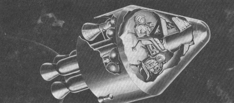
Created in 1961, one of the earliest pieces of concept shows operations inside the cramped confines of an Apollo capsule. Created in the gestation period of the manned spaceflight program, the design must have brought home to astronauts just how confined their journey would be, the cutaway section illustrating the thinness of the wall between cockpit and cold vacuum outside.
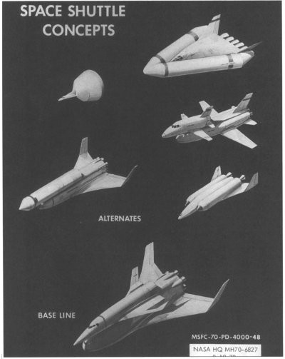
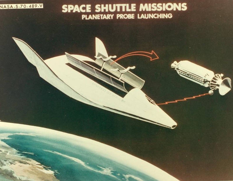
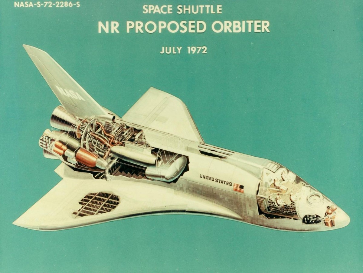
Ten years later, far more spacious designs were on the table as NASA searched for ideas about how the first reusable spacecraft would look. By 1972, nearly 10 years before the first shuttle launch, the designs had taken on a much more familiar shape (if you really want to get the detail inside that cockpit, there’s a high resolution scan here).
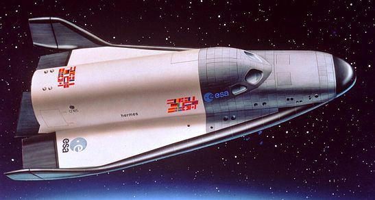
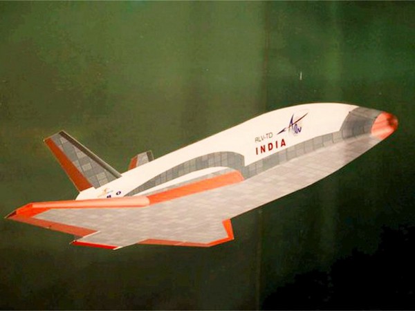
It’s worth noting how influential the shuttle design has been. The European Space Agency had its own take on reusable space craft with the Hermes shuttle in 1975, while the Indian Space Research Organisation created the concept below in 2016.
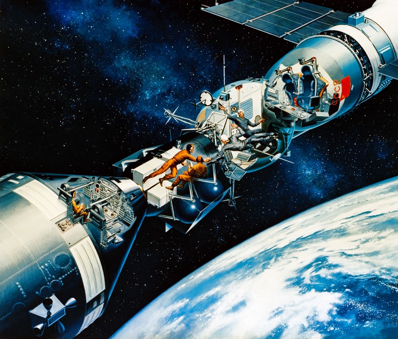
While the space race between nations was highly competitive, there were also moments of international collaboration. The following cutaway concept piece from 1975 envisions the historical docking of the Apollo and Soyuz crafts and the meeting of the two crews. Artist David Meltzer worked for NASA, as well as producing covers for science fiction novels. He also worked as a scientific illustrator at National Geographic for 30 years.
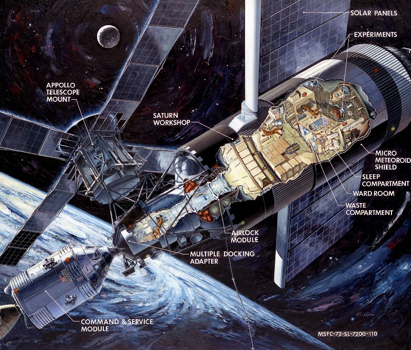
By the seventies, NASA artists had also come to grips with a more realistically sized space station. In this 1972 artist’s concept of Skylab (which was launched in 1973) it’s easy to lose yourself in the amazing details of life onboard (again for a more detailed version, click over to NASA).
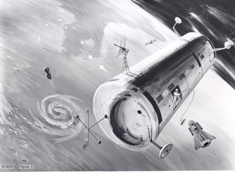
Compare that with the following 1960 concept of the United States Air Force’s proposed Manned Orbiting Laboratory below, or Wernher von Braun’s own circular concept above. You can also see an alternative view of Skylab by NASA artist Robert McCall here. Incidentally, McCall also painted the iconic poster for 2001: A Space Odyssey.

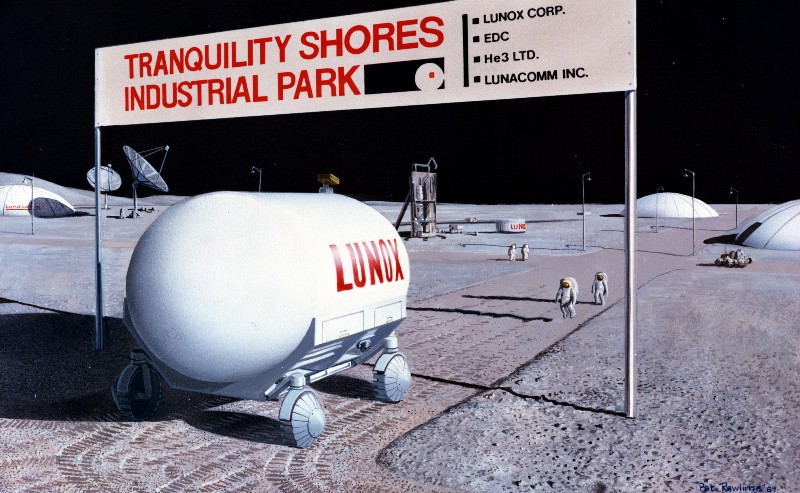
The Apollo missions would eventually lead to the first manned flight to the Moon, but NASA, ever thinking ahead, also envisaged what the first Moon base would look like through the imagination of long-term collaborator Pat Rawlings. Looking at the high-resolution scans, tiny details become apparent–such as the Mars landing craft with the number plate MARZ-A2.
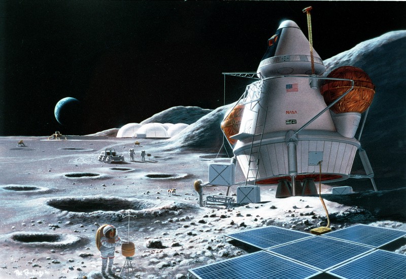
Once a base is firmly established it’s only a short step to building out-of-town industrial parks and the commercial exploitation of the Moon’s valuable resources.
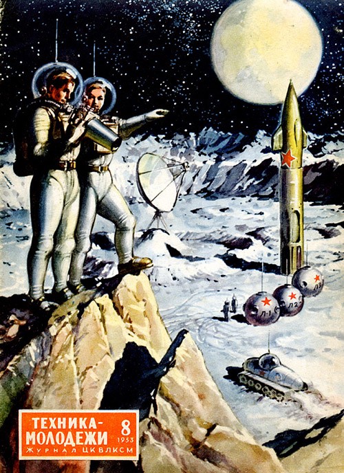
Not to be left behind, the Soviet Union was pretty keen on showing its cosmonaut men (and women) established on the Moon, too.

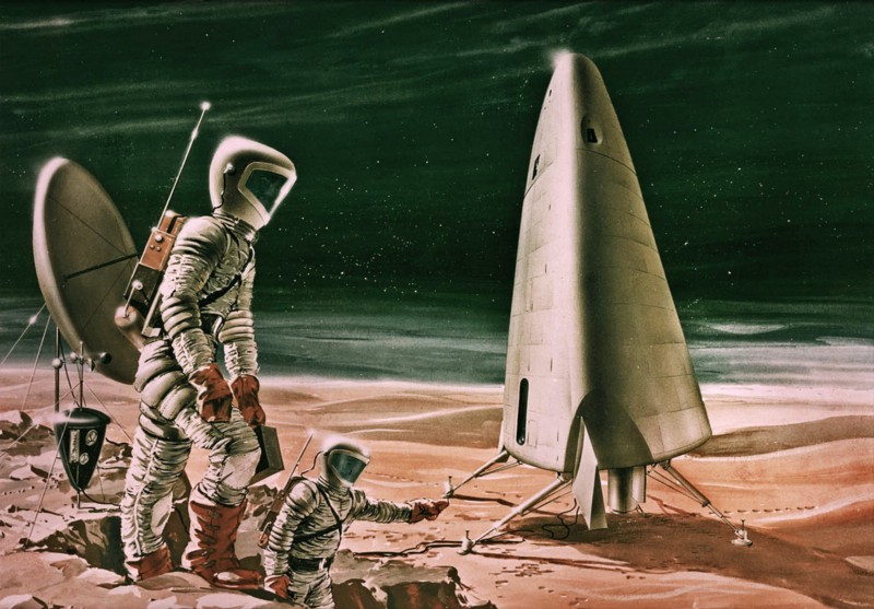
In the imaginations of most space enthusiasts, a Moon base is only ever a stepping stone to the colonization of the solar system. And from the very beginnings of NASA to the present day, artists have been looking to the future of man on Mars.
NASA was thinking about a manned mission to Mars as far back as 1963, in a series of studies dramatically entitled “Project EMPIRE” (which stood for “Early Manned Planetary-Interplanetary Roundtrip Expedition.”)
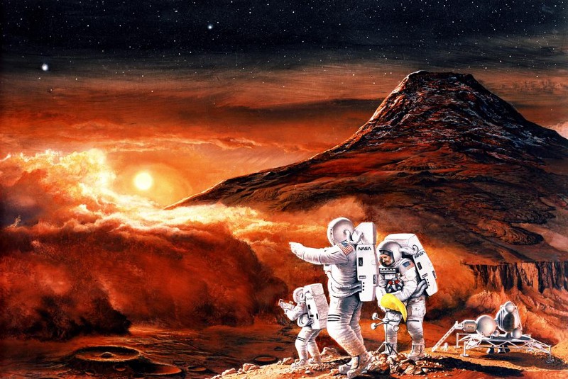
The color palette of Mars had changed dramatically by 1990 in the following painting by Ren Wicks, though standing and pointing into the distance seems a constant theme of space exploration. The scope has also become more epic, with dust storms gathering at the base of Olympus Mons, and the twin moons of Deimos and Phobos shining in the Martian twilight. There’s more of this artist’s work available at this link, which, while incredible, is definitely NSFW in a cheesecake sort of way.
After a visit to Mars, the next stage would be to establish a small base in which to live and conduct experiments, such as the small outpost in this 1992 concept by John J. Olsen. Olsen was no stranger to dangerous flight missions, having served as a pilot in World War ll in the Army Air Corps. In one memorable incident, he successfully landed his four-engine B-24 bomber after losing over 15 feet of one wing in a midair collision, saving 14 crew members and passengers onboard.
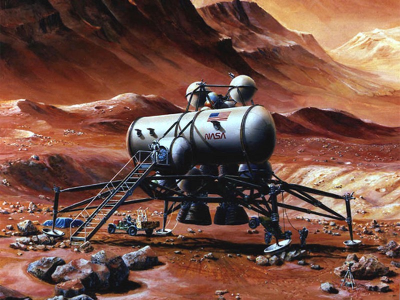
If man is to grow and thrive on Mars, then he’ll need to grow his own food–probably in small drawers in capsules buried underground. We’ll also need power, and the obvious source is the Sun, but don’t discount mining nearby Phobos for fuel.
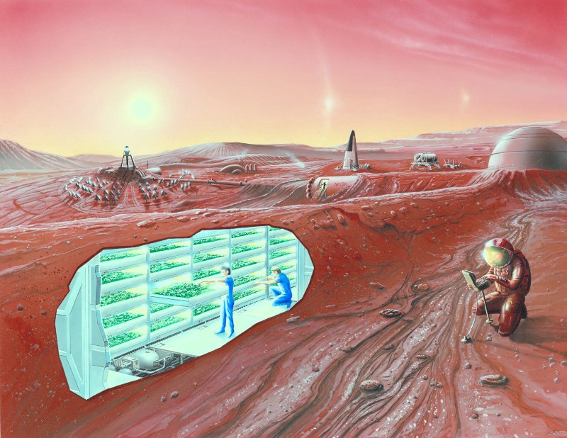
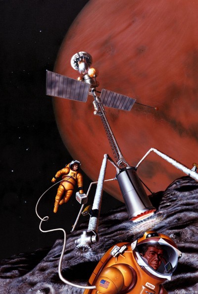
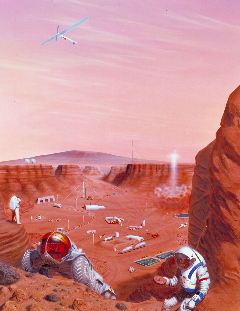
From these small bases life on Mars begins to grow. A launchpad helps establish traffic between Mars and Earth; a caterpillar-like, nuclear-fueled truck helps explore the surface; train tracks lead into a cavern deep underground; while a geologist finds what appears to be evidence of early life on Mars. It also seems that establishing flying aircraft on Mars was a key component of the colonization plan.

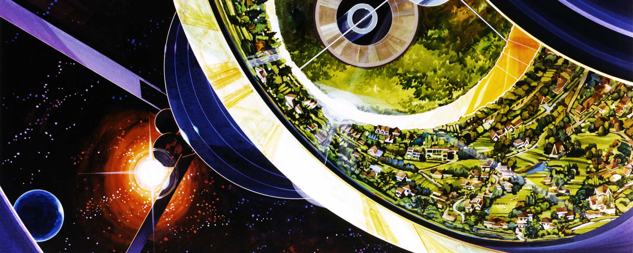
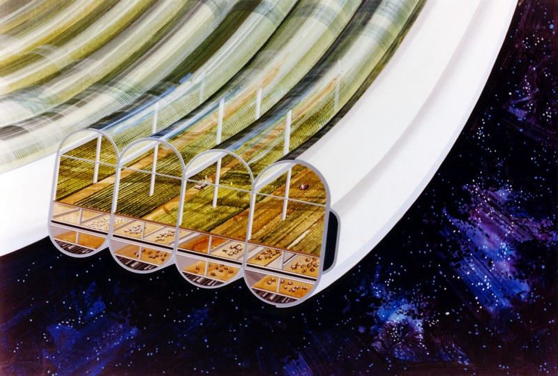
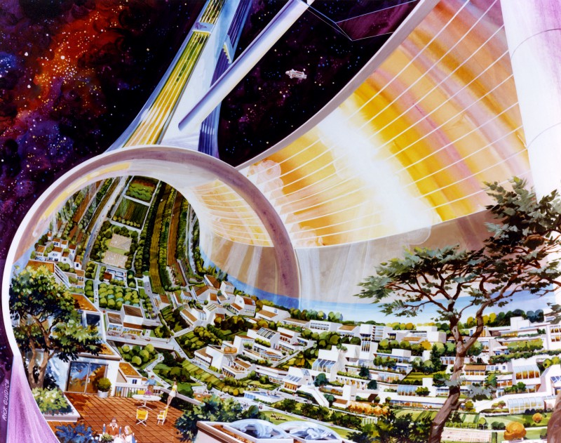
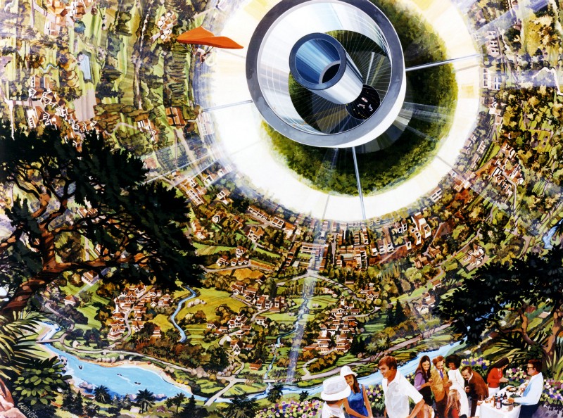
Then there’s the far future. Some of the most fantastical journeys ever taken by NASA artists have not been measured in light years, but in actual years, casting their imagination forward to monolithic space colonies, as seen in these studies commissioned by Ames and Stanford University in the 1970s.
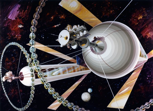
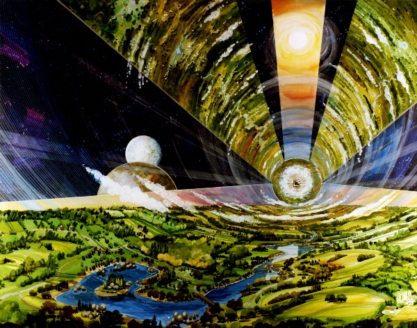
Designed to support anywhere from 10,000 to several million people, these gigantic constructions stretch up to 20 miles long, complete with their own weather systems, cities, sea-spanning bridges, and countryside to make us feel right at home.
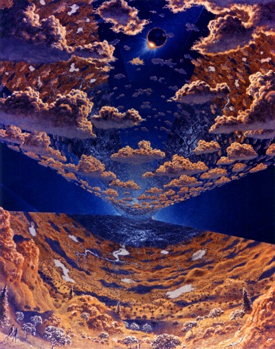
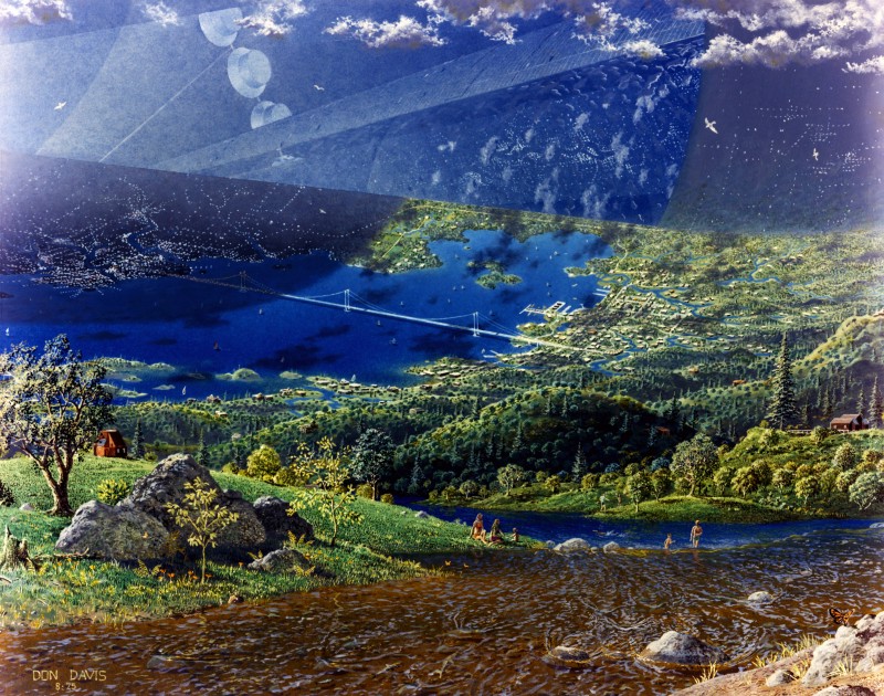
Every food need is taken care of with multi-level agriculture growing various crops and livestock.
Why let the fear of the cold, uncaring void just a few feet from your patio dining table stop you from having a delightful evening outside your space villa?
And if this isn’t enough, there are always suburban dinner parties and hang gliding to entertain you. You can see more studies from this utopian-looking space colony here.

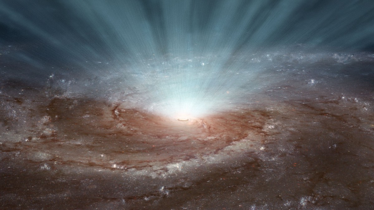
But why stop at our solar system? There’s a whole universe out there, and artists have proven adept at envisioning what’s beyond our probes and most powerful telescopes. What about views that only exist in data, analysis, and theory? What about a supermassive black hole blasting radiation and winds powerful enough to shut down star formation from the core of distant galaxy Messier 101?
Or, if that’s not to your taste, how about planets forming in the dust belt around the central star of the newly born UX Tauri system, 450 light years away?
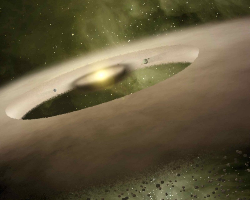

While many of these images might look far-fetched, they’re based on a close collaboration between artists, scientists, and engineers. In the same way that the recreation of supergiant black holes for movies is grounded in data and science, so too are these images based on the cutting-edge research of the time.
Consider how unbelievable Norman Rockwell’s “Man on the Moon” image must have looked before photographic images showed how close to the reality it really was. What then, from the above images, will look familiar in 20, 50, a hundred years from now? How long before von Braun’s revolving space station becomes a reality?
Ultimately, it doesn’t matter if our future looks like what artists have dreamt up for us or not. It’s the ideas and seeds that they plant that make us believe such things could exist that matter. Would the helicopter exist if Leonardo da Vinci hadn’t inspired us with the design of the aerial screw? Impossible to say, but at every step of our journey into space artists have been there to show us the possibilities, pushing at the boundaries of what mankind is capable of with their imagination and artistic skill, laying out the path to possible futures, and providing inspiration to generations of scientists, engineers, and explorers.
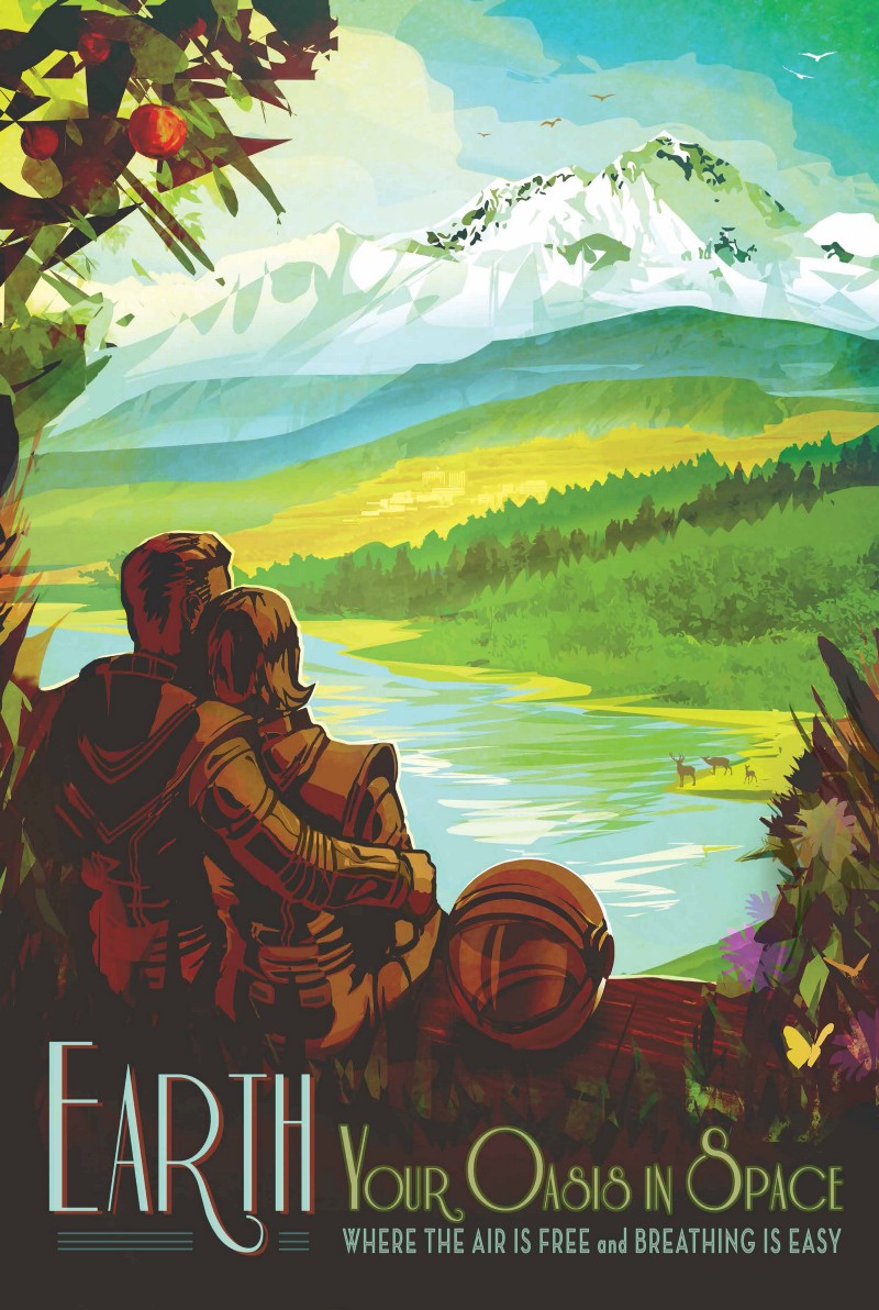
And just in case you’re now lost among the glimmering cosmos and all those possible futures, NASA occasionally likes to remind you that man’s first colony in space isn’t such a bad place to live either.

How We Get To Next was a magazine that explored the future of science, technology, and culture from 2014 to 2019. This article is part of our Above & Beyond section, which looks at our understanding of the universe beyond Earth. Click the logo to read more.

