

I’ve spent the last couple of days at OpenVisConf18 in Paris. I enjoyed talks from a diverse group of designers, developers, and data journalists about the systems, tools, and processes they use when visualizing data. I hoped to come away with some inspiration and ideas for future visualization work that we can do on How We Get To Next.
One of my favorite sessions was from Maarten Lambrechts. Maarten is the creator and curator of xeno.graphics: a collection of charts that are weird, to a greater or lesser extent. Most of us are familiar with bar, line and pie charts, and we know how to read them without too much thought. Xenographics take a bit more effort on both the part of both the creator and the reader to understand what’s going on. They can be fun alternatives to the classic bar, line, and pie chart trio, but they serve a serious function, too: it’s important to experiment with new forms of visualization, which can be more effective for certain kinds of data than standard formats.
Let’s take an example:
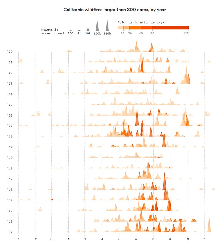
This is a Fire Plot, created by Erin Ross for Axios, showing the largest wildfires in California. The vertical axis is time (from 2000 to 2017), while the horizontal one is also time (January to December of that year). Along each year line, fires are plotted with a height indicating the area that they burned and a color that shows their duration in days. It immediately shows not only which years had the worst wildfire season, but also the severity of individual events. You can quickly see both the big picture and the detail.
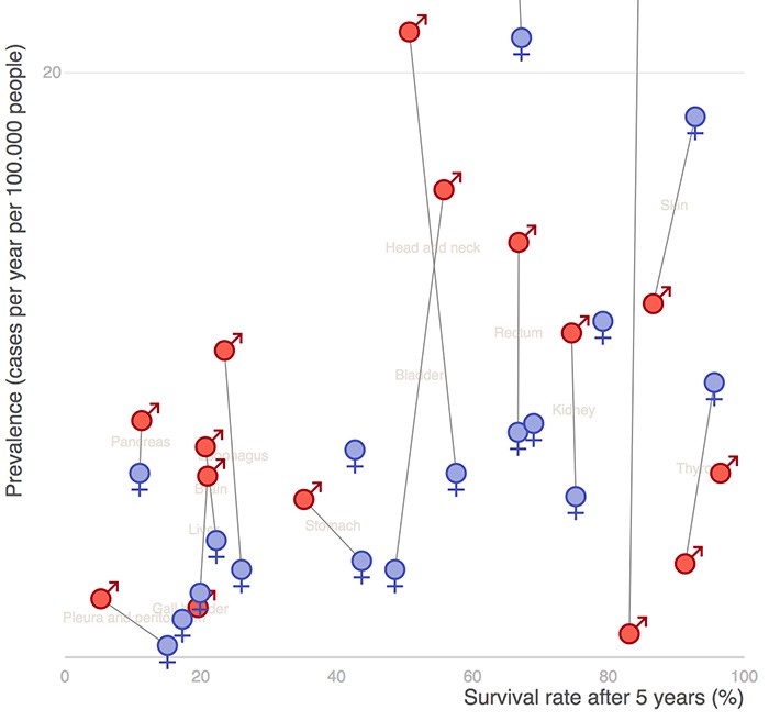
Here’s another example, created by Maarten himself for De Tijd. This is a Scatterline Plot: a scatterplot with lines drawn between dots that share a category. In this case, the dots are the male and female prevalence and survival rates for a variety of different cancers, represented by a line. Again, it’s possible to see big-picture findings, like the generally greater prevalence rate for many cancers in men, as well as detail for individual points.
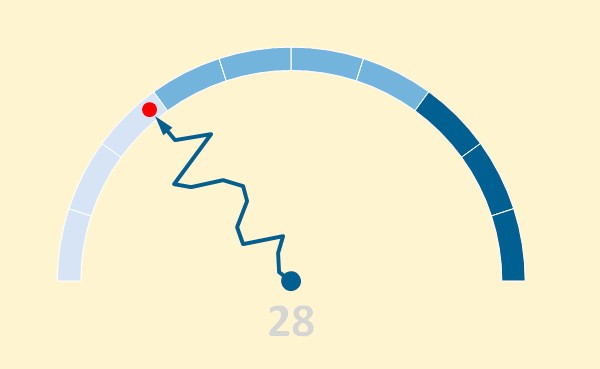
This one’s fun. It’s the Drunken Speedometer, by Jorge Camoes. The arrow points to your current speed, but the wobbly line between the arrow and the centre point shows how that speed has changed over time. Given that a real speedometer needs to be as clear and quick-to-read as possible, Camoes describes it as “the most dangerous chart alive.” I wouldn’t recommend getting one installed in your car.
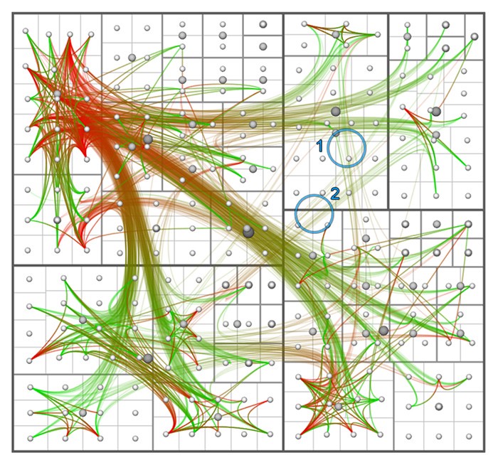
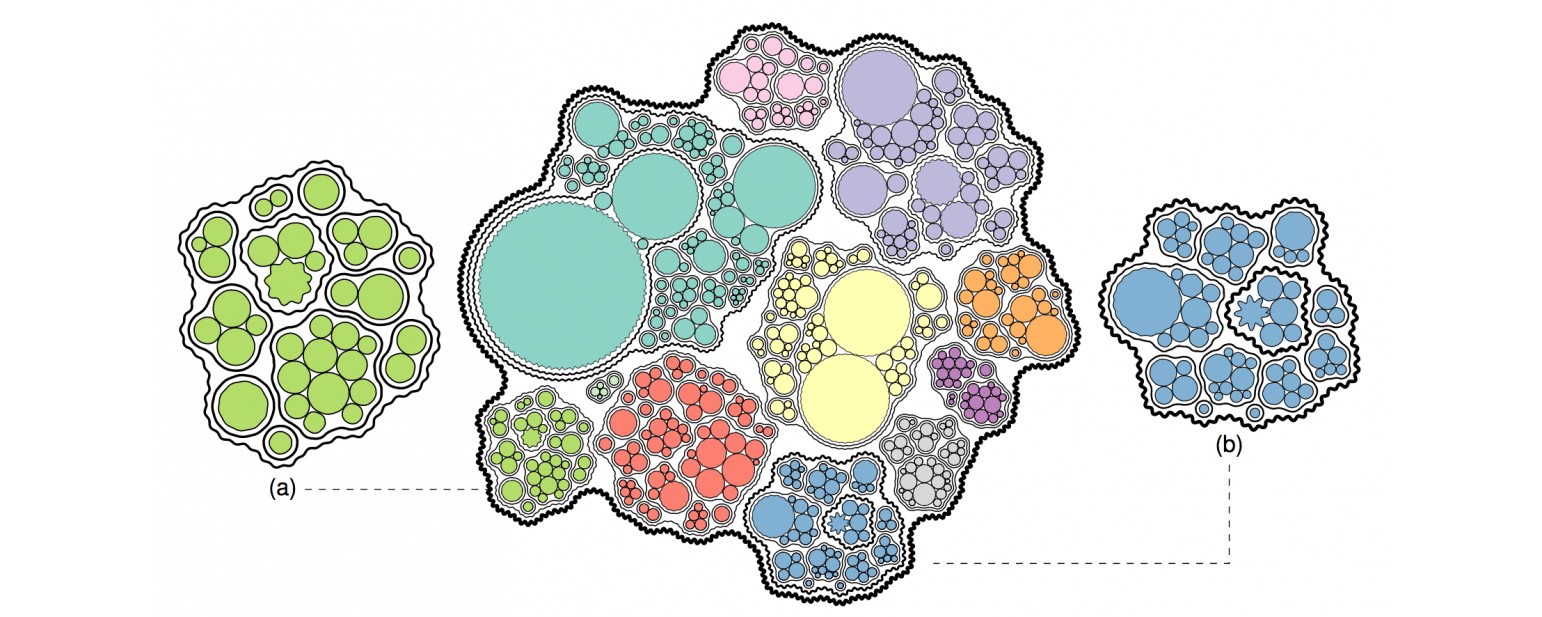
The last one I’ll show you is Hierarchical Edge Bundling, created by Danny Holten in his PhD thesis. This one looks terrifying, but it’s actually reasonably simple: each box is a different part of a computer program. The position of the boxes inside bigger boxes show their hierarchy in the program, while the colored lines show which parts are activating other parts. The green end of each line shows the bit of the program that’s activating the part of the program at the red end of the line.
You can find lots more examples on xeno.graphics, and if you come across any other examples on the web, be sure to submit them. Although the term “xenographic” is relatively new, visualization pioneers like William Playfair and Charles Minard would have recognized it easily. They had to contend with the problem of every chart they used being a xenographic to their audience–people for whom the very concept of information visualization was “foreign.”
W. E. B. Du Bois, himself something of a data visualization pioneer, was quoted at OpenVisConf by the Washington Post‘s Aaron Williams, saying: “visualization can facilitate liberation.”

How We Get To Next was a magazine that explored the future of science, technology, and culture from 2014 to 2019. This article is part of our Arts & Culture section, which looks at innovations in human creativity. Click the logo to read more.